Jessica Porter
Nestled in the heart of the Midlands, this branding project was shaped in collaboration with a lino-print artist whose work captures the quiet poetry of the natural world. From tangled brambles to nesting birds, her prints are a celebration of British flora and fauna, especially those found tucked away in woodland corners. As she returned to sharing and selling her work online, she needed a visual identity that felt like home: warm, rich, and grounded in the hand-made process she knows so well. Together, we crafted a brand that feels like stepping into a forest – layered, textured, and alive with detail.
- Branding

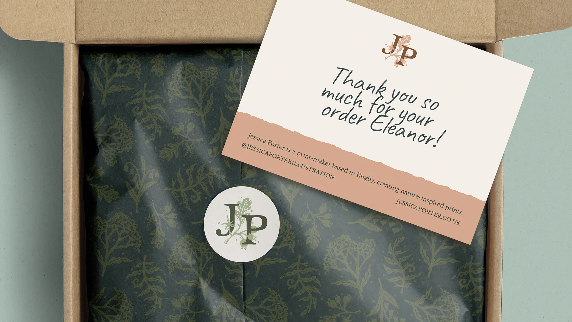
The logo takes root in Jessica’s own illustrations; a gently stylised piece of foliage drawn from her woodland prints, with imperfections and wobbles, as we see in her handmade work.
Paired with a serif typeface that balances tradition with a hint of character, the wordmark brings a touch of formality without losing personality. It feels grounded, but not too polished, like something with a bit of soil under its nails.

The colour palette draws from nature; soft, earthy tones like moss, clay, and seedheads, balanced by richer heritage shades that bring depth and quiet contrast. Everything sits comfortably against a soft white and deep inky blue, like paper and nightfall, a pairing that gives the brand space to breathe.
The patterns are directly lifted from her original lino prints, echoing the tangle and abundance of wild places. Think flowering meadows, mossy logs, and hedgerows alive with detail. Some designs play with high contrast, others explore subtle tonal shifts, and together they feel both vintage and contemporary, rooted and expansive. Perfectly suited to packaging, postcards, or even a gallery wall.

"I’ve admired Clare’s beautiful work for a long time, so when it came to the branding for my own business, I knew that I wanted her to design it.
From the very beginning, she was just as enthusiastic and excited about the potential of my branding as I was, and it’s clear she genuinely cares.I wasn’t familiar with the process, but Clare made everything feel effortless, guiding me through each stage and highlighting key design elements I hadn’t even considered. She shared an abundance of ideas and presented two carefully considered routes we could explore together. Clare instinctively understood the aesthetic I was going for and translated my ideas into a visual identity that felt completely aligned with my business. I couldn’t be happier with the final result and I can’t recommend Clare enough; you can just feel how much heart she puts into her work."
Jessica Porter
