Redcap Grove
A collaboration of absolute dreams, Redcap Grove is an incense brand rooted in British folklore and natural rituals. The aim was to develop a carefully considered identity that reflects the craft and authenticity behind the products, while feeling at home alongside thoughtful independent retailers such as Mon Pote, Bristol General Store, and Nook.
Working closely with the founder, a designer himself, the process felt collaborative from the beginning. He came with a strong vision for the world of the brand, and my role was to help translate those ideas into a clear, cohesive system that could live confidently on packaging, in stores, and across the wider brand experience.
- Illustration
- Branding
The foundations of the brand
I built the identity around a small but thoughtful toolkit designed to balance mystical craft with a contemporary, shelf ready presence.
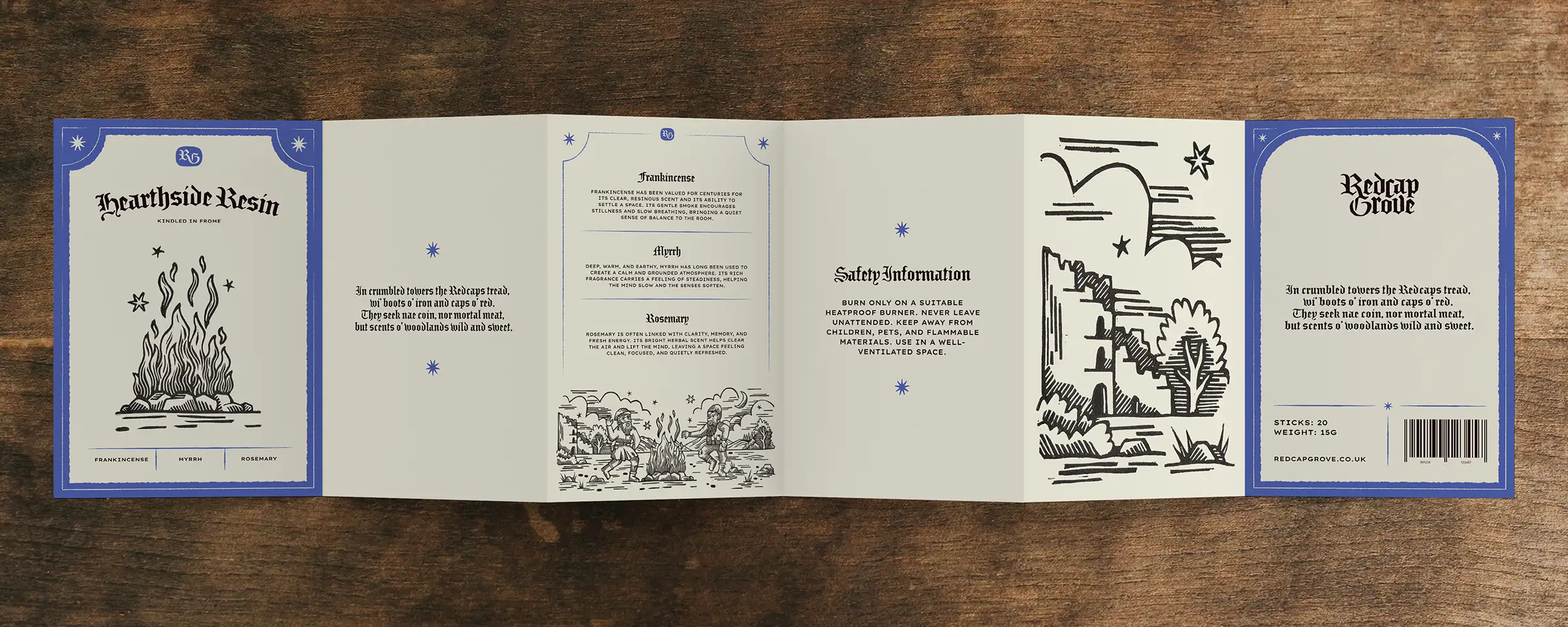
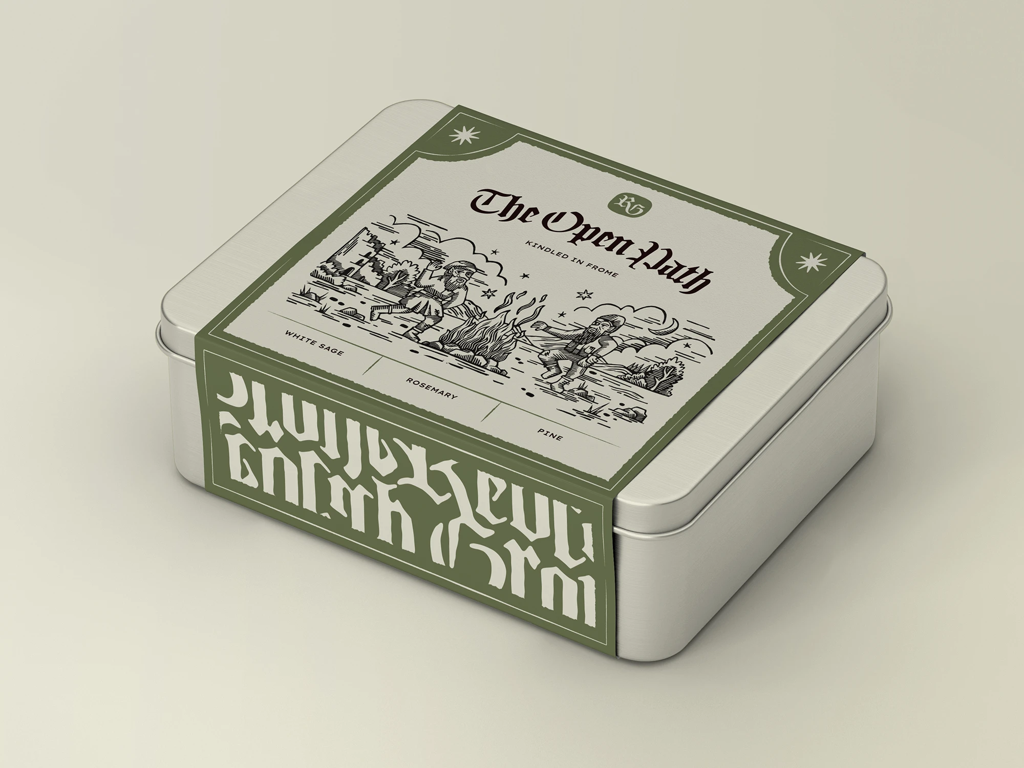
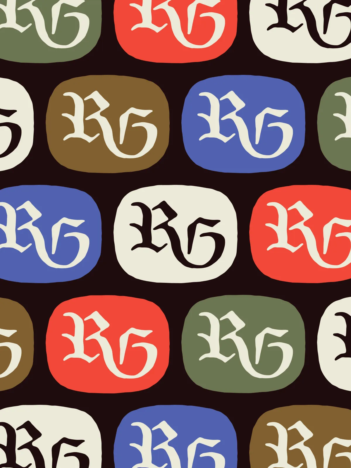
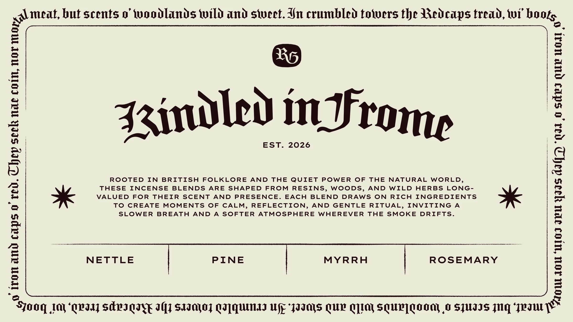
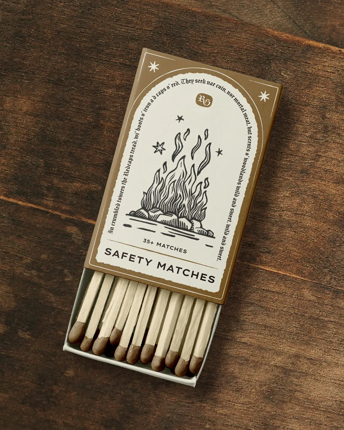
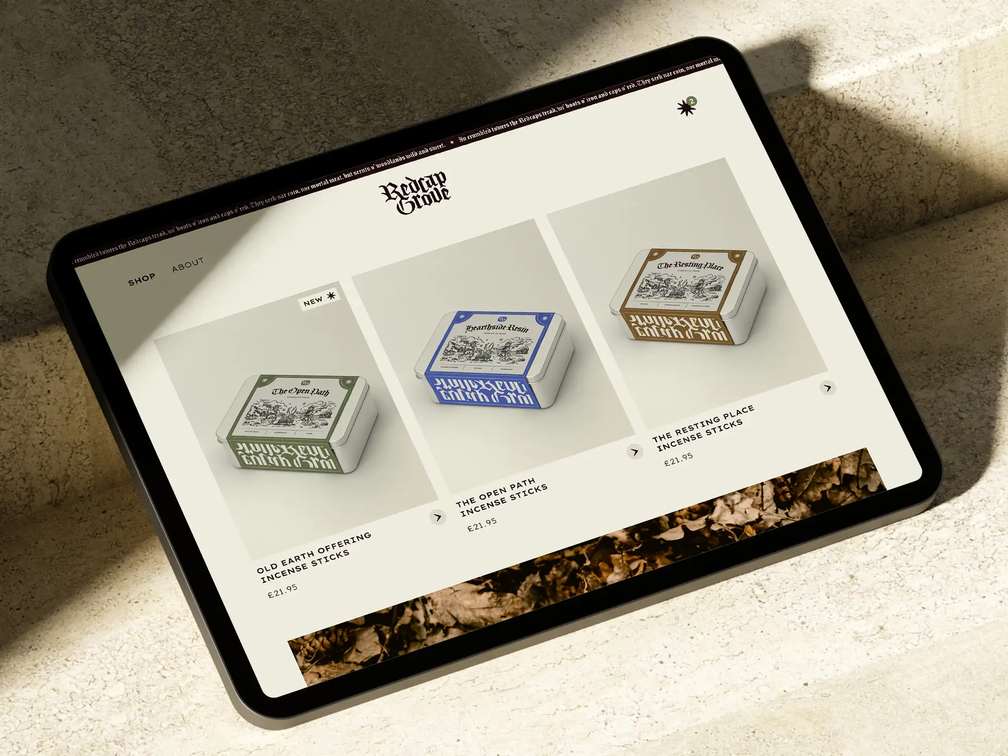
At the centre is a rugged yet refined wordmark that draws on wood-carvings, gothic type characters, and illuminated texts. Paired with a distinct monogram, it gives the products a recognisable mark that feels both distinctive and grounded.
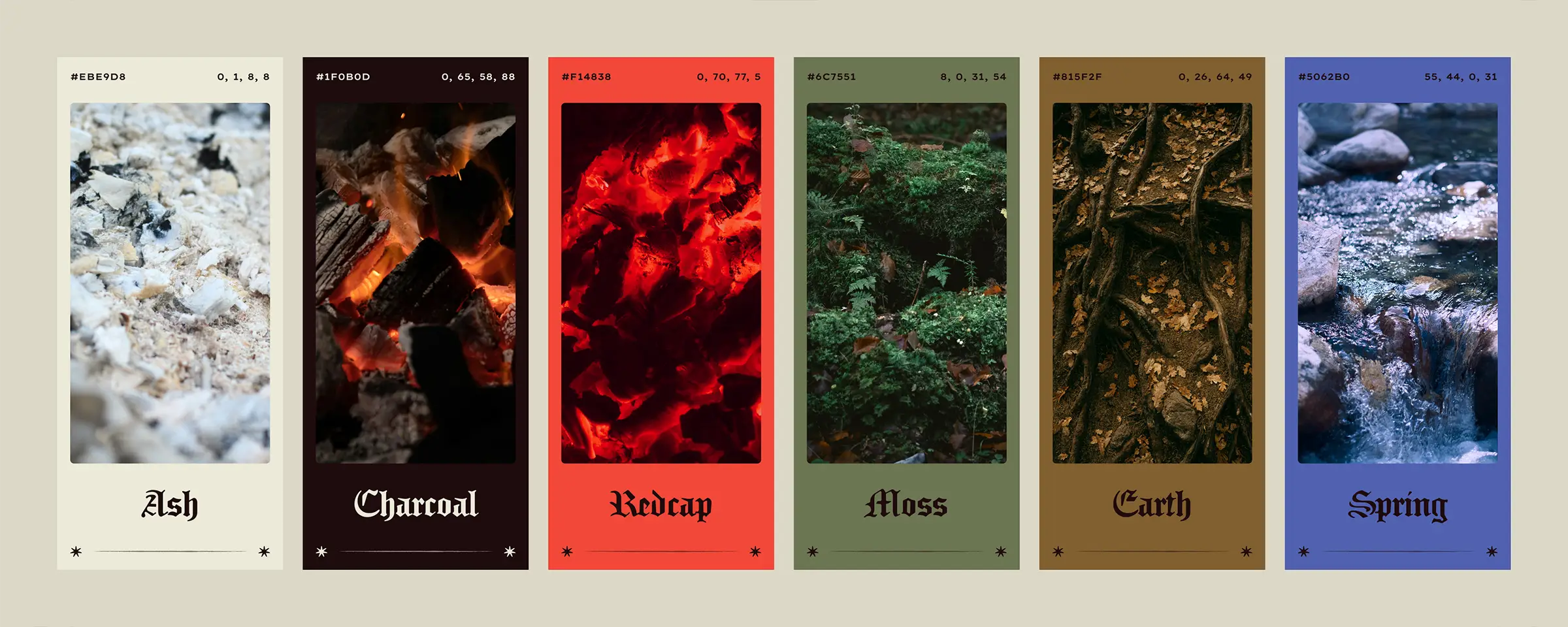
The colour palette takes its cues from natural tones, combining earthy naturals and bolder twangs to create a mood that feels rich and atmospheric without becoming overly dark or heavy.
Typography pairs an ornate blackletter with monospace Lexend Peta, bringing a distinct confidence to the identity.
A brand rooted in craft and place
The result is a brand identity that feels atmospheric, considered, inviting and spiritual, capturing the quiet ritual of incense while remaining approachable for modern retailers and customers.
The identity gives the blends a sense of story and place, while still allowing the ingredients and materials to take centre stage.
Most importantly, the project reflects the collaborative nature of the process. By working closely with the founder and shaping his initial ideas into a cohesive visual language, the brand now has a toolkit that can grow with it, supporting new scents, seasonal releases, and future expansions while staying rooted in its original spirit.
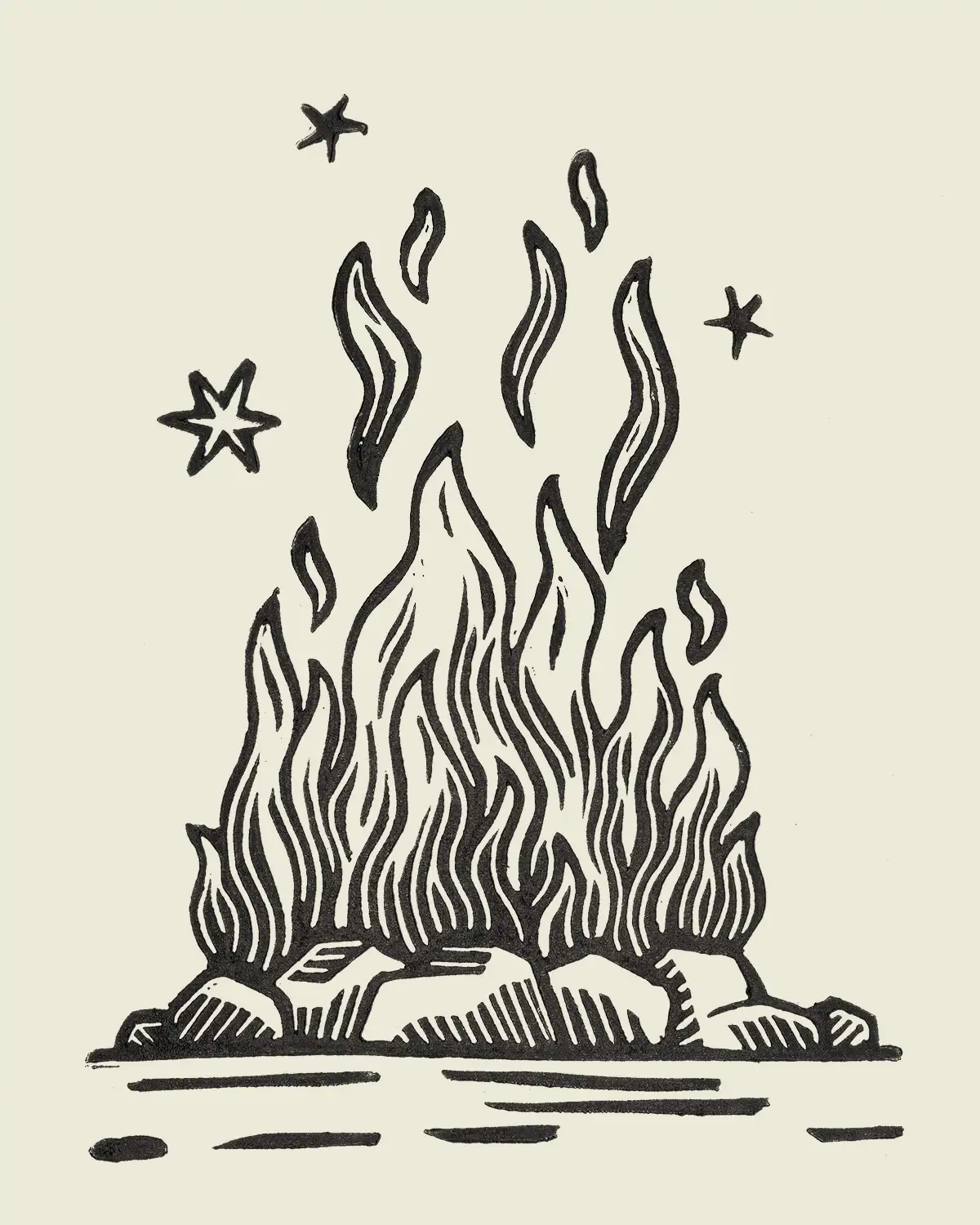
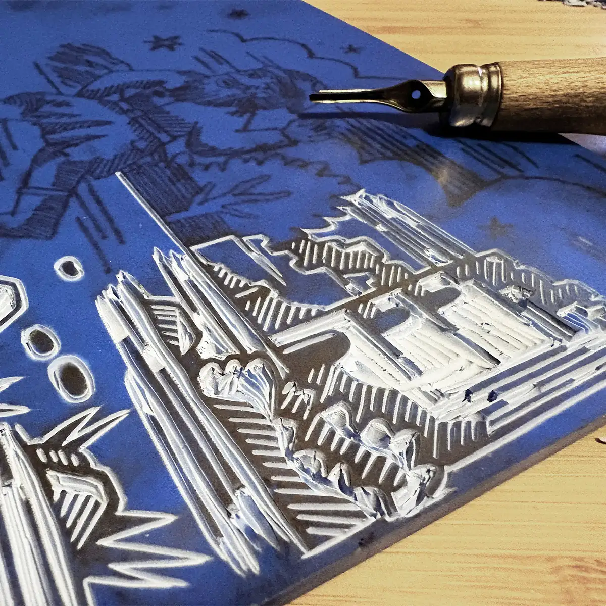
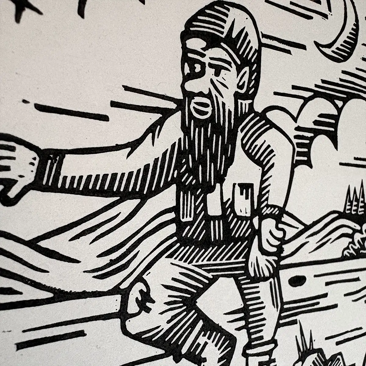
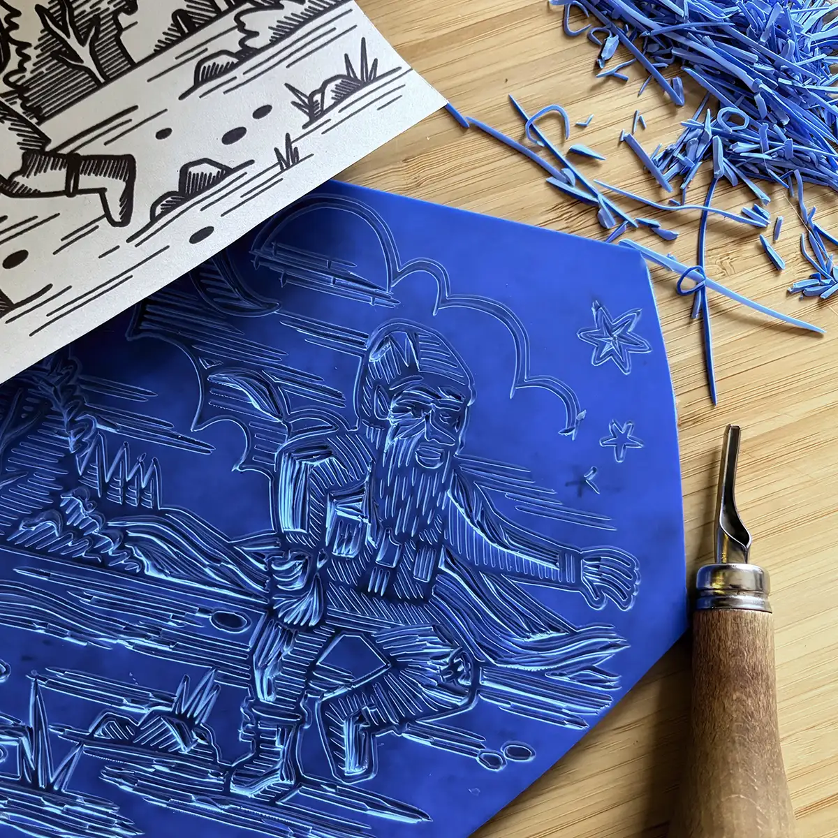
Carved marks and old tales
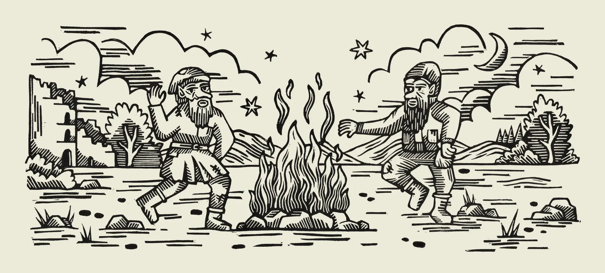
The illustrations introduce the more whimsical, folkloric side of the brand. Using lino carving techniques inspired by historic woodcut prints, I crafted the artwork to carry the texture and character of traditional mark making while feeling fresh in its application.
The scene draws on familiar storytelling motifs from both folklore and old printmaking, including a crumbling tower, distant woodland, and a cast of jovial characters. Together these elements help build a small narrative world around the brand, giving it a sense of age and charm while remaining clear and contemporary in its presentation.
“Working with Clare on Redcap Grove was such a smooth process from start to finish. She really understood what I was trying to build right away.
Whenever something needed refining, she was open and genuinely receptive to feedback, which made the whole experience collaborative and easy. The level of detail and the little embellishments she brought into the brand were incredible — I’m honestly so impressed with where she’s taken it. I wouldn’t hesitate to recommend her!”
Samuel Gibbs, Founder