Yellow Peach
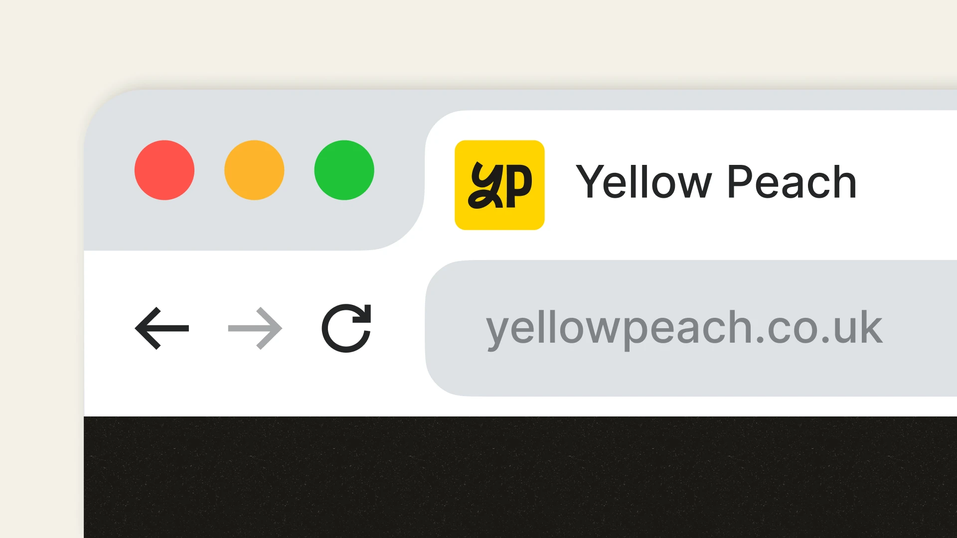
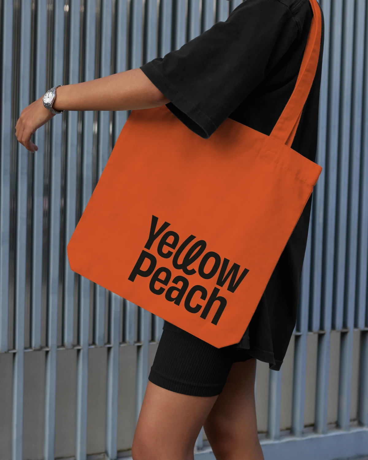
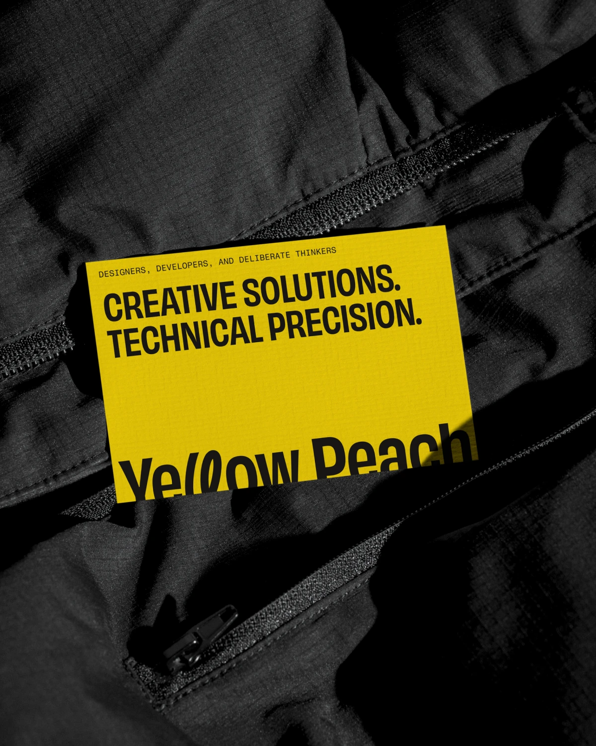
Created for digital design and development agency Yellow Peach, the identity balances creativity with technical precision, reflecting their approach to building future-ready digital experiences. The logo combines a clean yet characterful sans serif wordmark with a looping double “L” device at its centre, bringing a sense of momentum, adaptability, and progression to the mark while communicating the deliberate and considered thinking that underpins the studio’s work.
- Logo Design
- Branding
Designed to evolve
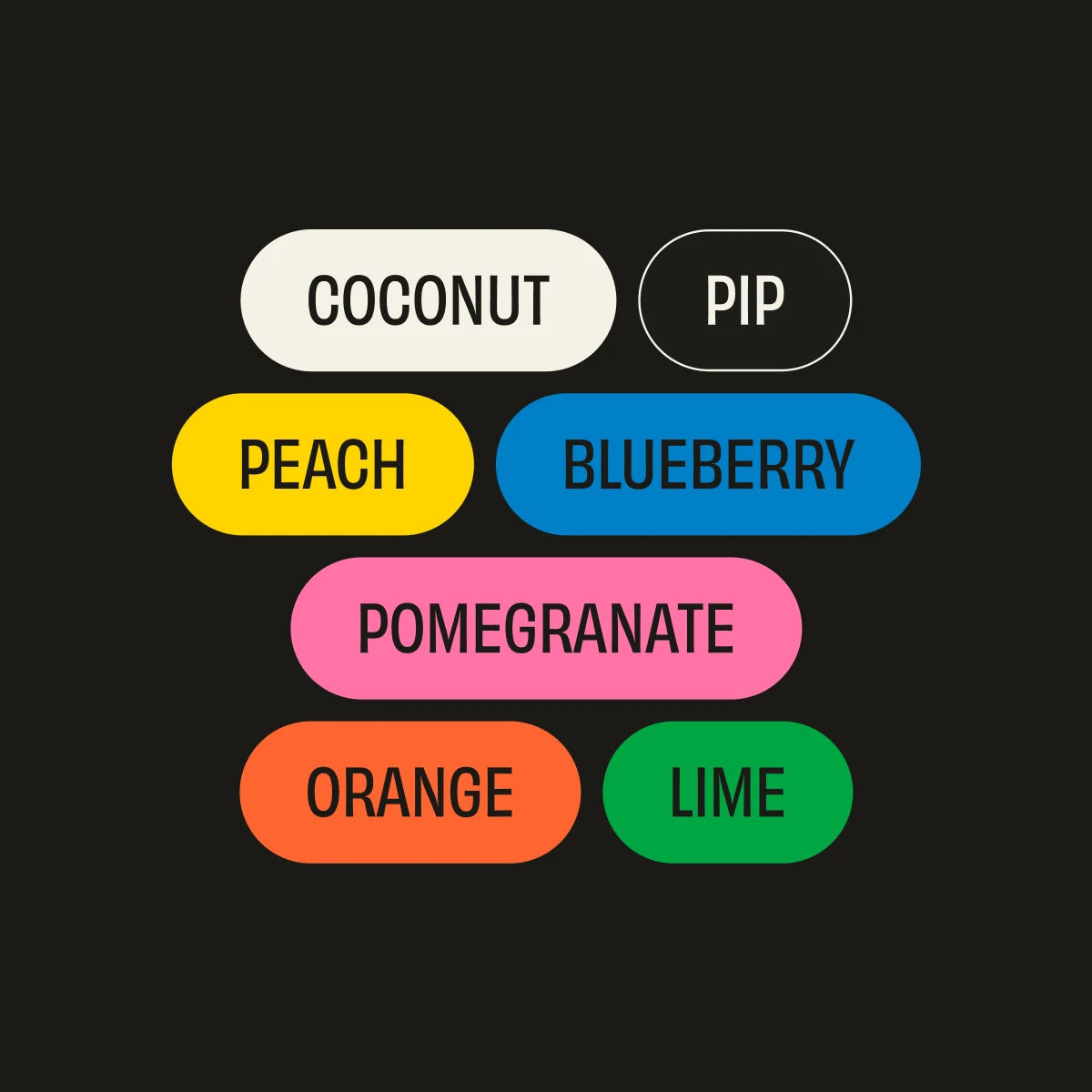
Although the brief focused on the logo alone, the process naturally opened up wider conversations around how the identity could grow over time, particularly through colour. An earlier concept introduced a more expressive palette that felt unexpected within the digital space, balancing warmth and maturity with a quiet sense of confidence. Those initial explorations helped shape the direction of the wider visual language, influencing colours that now carry through into the evolving brand and website experience.